
THe Skagit
STYLE GUIDE
Your Website’s Design Playbook
Think of this as your site’s cheat sheet — all the fonts, colors, and buttons you’ll use, right here in one place. It’s a safe spot to experiment, test, and keep your design looking consistent.
COLOR USEAGE
Your site’s color palette keeps everything looking polished and on-brand. Use these core colors as a guide when customizing your template.

HEX:#514f4e
DARKEST
For your strongest contrast text and main headlines.

HEX:#514f4e
DARK
A softer secondary text or icon color.

HEX:#ccccc1
LIGHT
For softer section backgrounds or text highlights.

HEX:#fff9ef
LIGHTEST
Your base page background color.

HEX:##6c6b46
BRIGHT
The “pop” color for CTAs or decorative elements.
Font Useage &
Typography Suite
How to use:
These font styles are applied consistently across your template to keep your site cohesive and polished. You can swap them for your own brand fonts, but aim to keep choices and sizes uniform throughout. This template uses Kajabi’s built-in font style settings for headings, body text, and buttons to ensure consistency sitewide. If you are uploading custom fonts this is where you will do it.
Heading Font
Strong and attention-grabbing. Use for page titles, section headings, and important callouts. This template uses Playfair Display, but you can use the button below to add your custom font.
Recommended sizes:
H1 Desktop: 64px
H2 Desktop: 48px
H1 Mobile: 48px
H2 Mobile: 36px
Subhead Font
Elegant and sophisticated. Use for subheadings between main headlines and body text. This template uses EB Garamond to bridge the gap between display and body typography.
Recommended sizes:
H3 Desktop: 30px
H4 Desktop: 24px
H5 Desktop: 18px
H6 Desktop: 14px
H3 Mobile: 24px
H4 Mobile: 20px
H5 Mobile: 18px
H6 Mobile: 14px
Body Font
Readable and versatile. Use for paragraphs, captions, and longer text blocks. This template uses Open Sans for a comfortable reading experience across devices.
Recommended sizes:
Body Desktop: 14px
Body Mobile: 14px
ACCENT FONT
Use sparingly for emphasis — labels, numbers, captions, and special callouts. This template uses Space Mono to add character without overwhelming the main typography.
Recommended sizes:
Labels Desktop: 12px
Numbers Desktop: 14px
Labels Mobile: 11px
Numbers Mobile: 13px
YOUR CUSTOM FORM
CANVA TOOLS & LINKS
CANVA LINKs
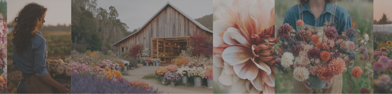
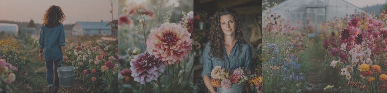
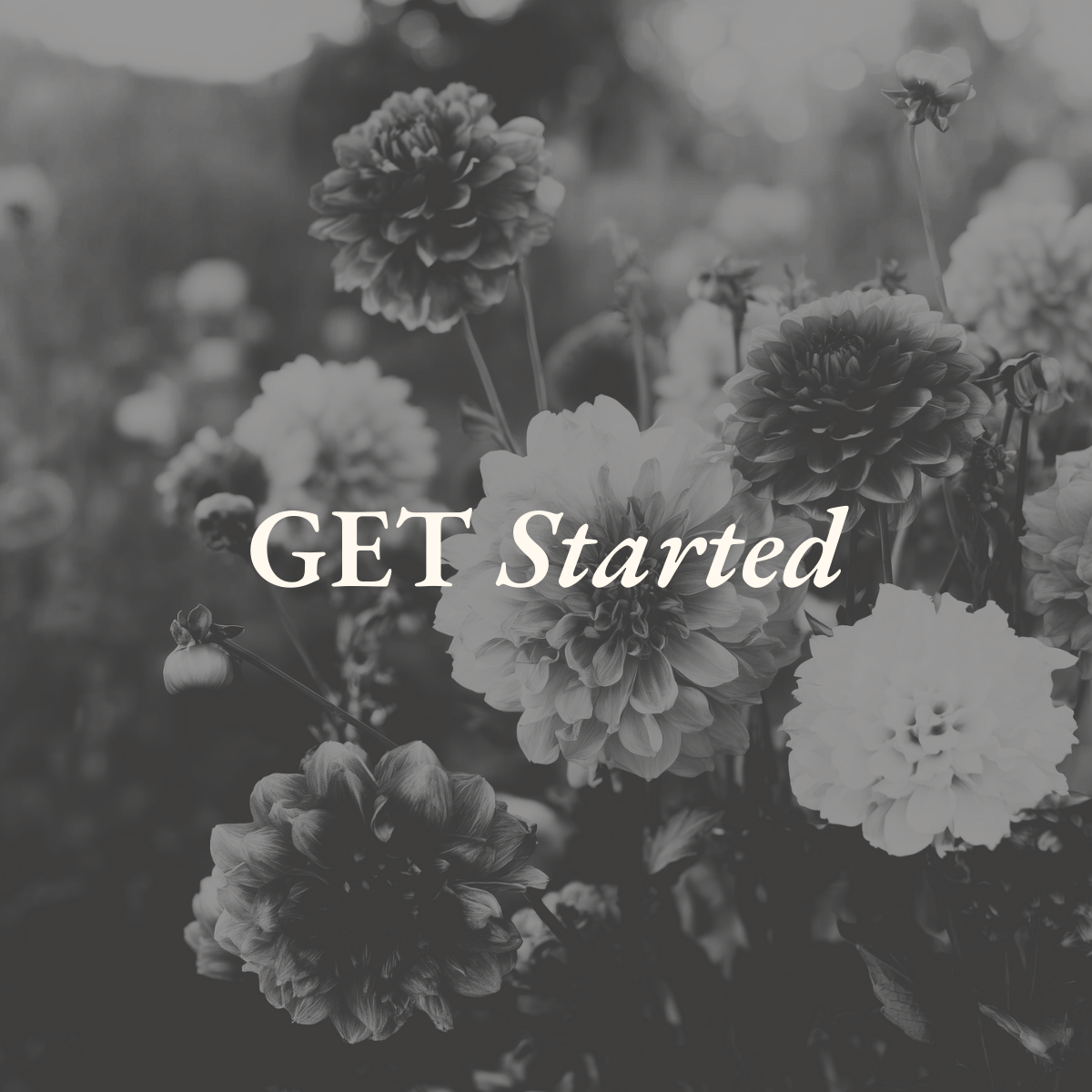
Square image
Use Canva to crop and edit images so when you upload them they are consistent throughout your site.

Canva Links
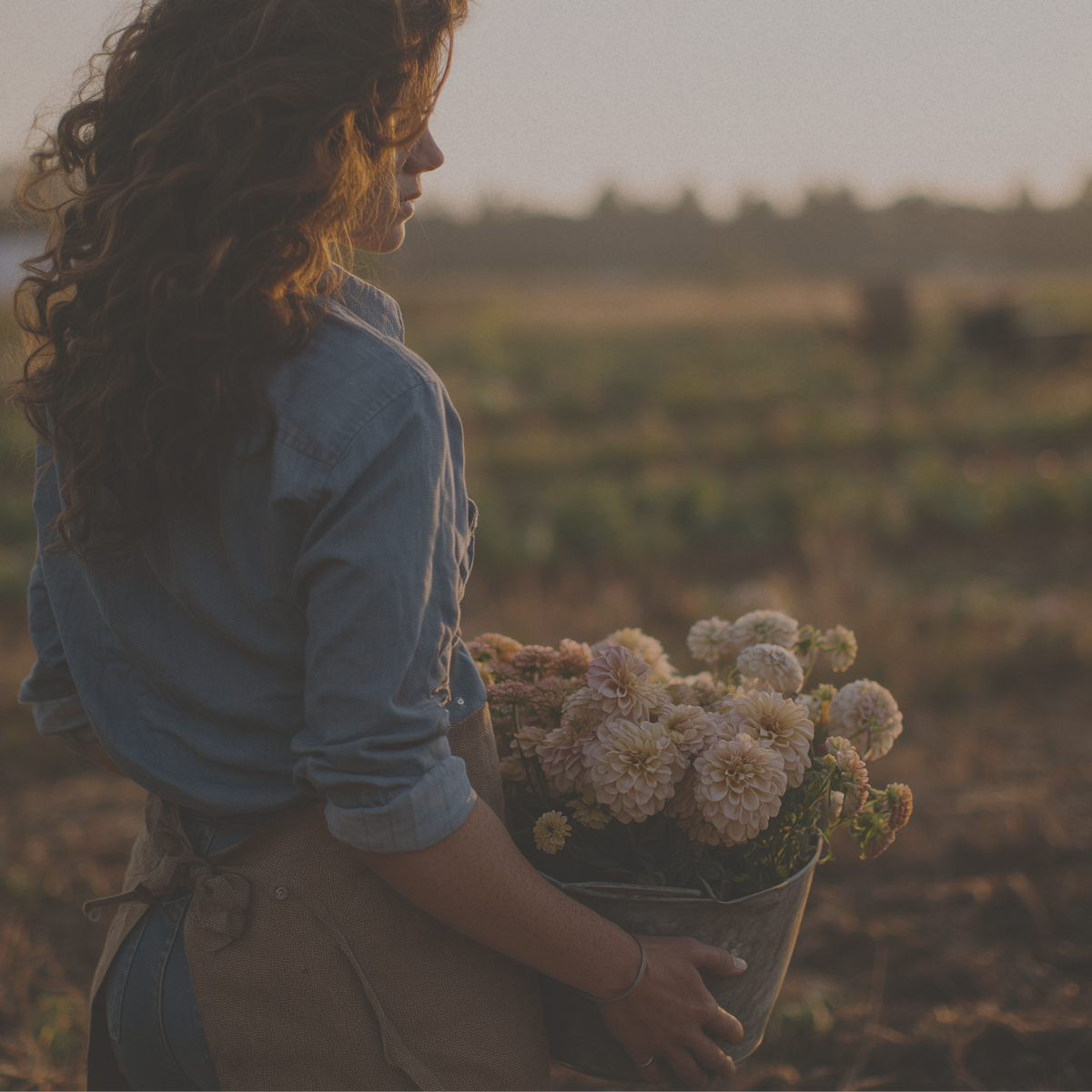
Tall image
Use Canva to crop and edit images so when you upload them they are consistent throughout your site.

Canva Links
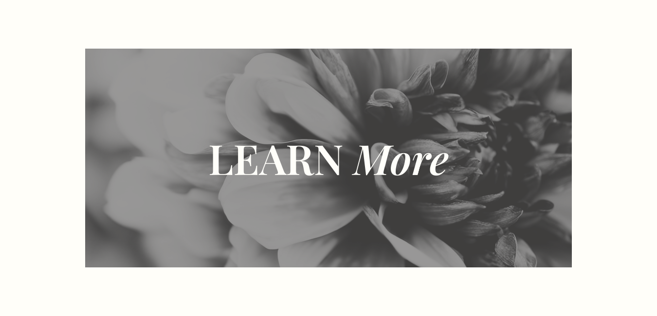
BANNER SKINNY image
Use Canva to crop and edit images so when you upload them they are consistent throughout your site.
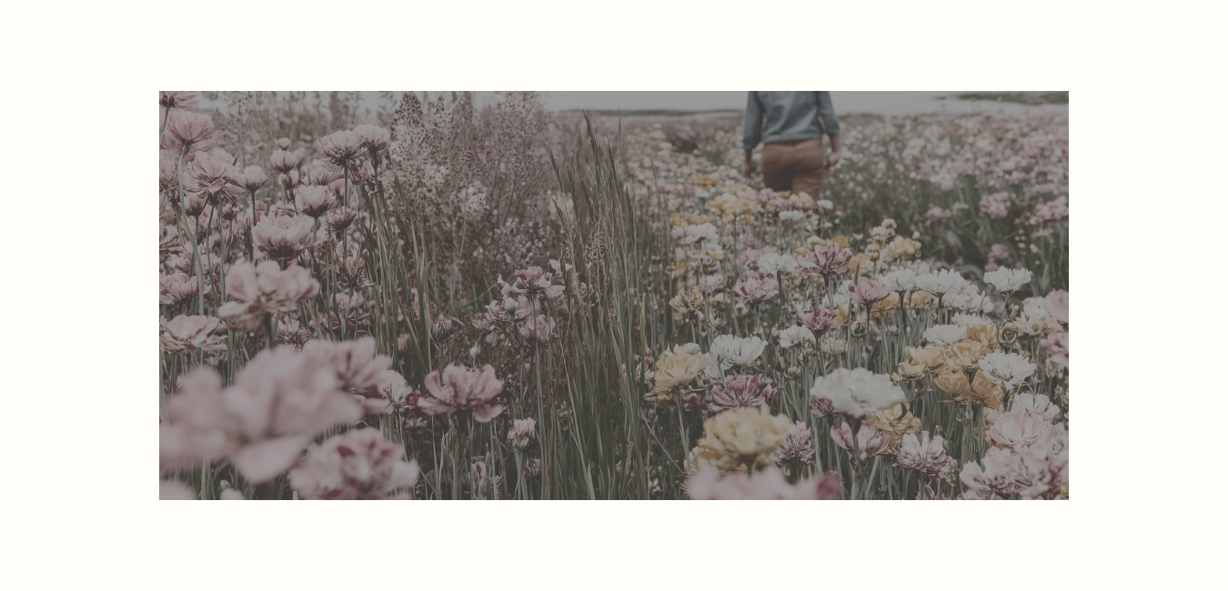
Canva Links
BANNER WIDE image
Use Canva to crop and edit images so when you upload them they are consistent throughout your site.
HOVER CARDS
These are your hover cards, swap them out for your images, patterns or graphics (and don't forget to play around with how they work).


Amazing Feature
new offering // blog category
Short preview text for your post goes here. Share a quick intro, highlight the topic, or give readers a reason to click through.
Amazing Feature
new offering // blog category
Short preview text for your post goes here. Share a quick intro, highlight the topic, or give readers a reason to click through.

Resources
Tools + Support for Your Template
Here you’ll find everything you need to confidently edit and launch your new template. From step-by-step tutorials to options for custom support, these resources are designed to make the process simple and stress-free.
– Services: Hire me for template edits, upgrades, or custom add-ons.
– Tutorials: Access detailed guides and walkthroughs to help you edit your site with ease.
– Contact: Get in touch for support, questions, or collaboration.
© 2025 MAPPHOUSE LCC / FAQs / Policy & Terms / Site Credits
